|
7/5/2012 0 Comments Still-life still going 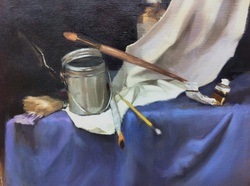 A fun day in the studio today amping up the colour in my current still-life painting!
I intentionally pushed the colours today because each time I come back to the painting after it's dried, it looks a lot duller in chroma since I left it. I'm only working on it once a week at this stage because of other projects taking up my time. But it's helpful because it allows enough time for the paint to dry. This means I can rework areas that need it and start afresh. There's nothing more frustrating than trying to paint with oils over a tacky surface. The drapery on which the objects are placed is actually a dull blue-grey. I'm obsessed with violet, and the purple appeared almost unconsciously. It's a combination of crimson red and ultramarine blue, slightly cooler in some areas. What I've discovered creating a vibrant purple colour from a grey drape, is how malleable and free colour is. NB however, the key is getting the tone spot on. If you get your tones right, and the tonal relations working well, you can pretty much do whatever you want with the colours. I've contrasted the blue and violet with orange and yellow, in varying degrees. The juxtaposition is harmonious and subtle in some areas (e.g., the two fat paintbrushes to the left), and clashing and conspicuous in other areas (especially the yellow handle and orange tip of the two central brushes). Mixing a hint of either colour into neutral colours (greys, browns) unifies the work. Next session I'm targeting the middle section of the white drape (PS pale drapery is a bitch!!). I'll be adjusting some edges too, trying to keep them soft and smudgy. New pics will be posted next week.
0 Comments
Leave a Reply. |
 RSS Feed
