|
For all their eclectic detail, the illustrations of Vietnam-born and US-raised artist, Tran Nguyen, are strikingly still and quiet. They’re emotionally charged but subtle. Sentiment seeps through careful, clean layers of watercolor and acrylic glazes. For Tran, visually depicting emotion is key, especially universal feelings that we have inevitably experienced in our lives, whether it be loss, nostalgia, regret, revelry or longing. In this way, despite their peculiarity and eccentricity, Tran’s paintings are by no means exclusive or inaccessible. Her works slip into the surreal. Figures are embedded in timeless, placeless worlds. Tran notes, “I try to pinpoint concepts that can't be confined by culture.” Visual symbols serve as whimsical fragments, provoking contemplation without answers. The viewer is only offered clues as to the subjects’ context and personal history. Tran is influenced by the stories of Hayao Miyazaki, whose style, she explains, “is sweet and simple, yet the emotions his characters endure are complex and fervent.” There is this same juxtaposition in the artist’s work – of simplicity and naivety on the one hand, and complexity and pathos on the other. Her young figures appear as old souls. 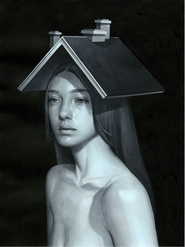 In “And Our World Came Tumbling After”, a neoclassical figure reminiscent of a Bouguereau youth stares at ghostlike repetitions of herself. Beneath, she rests her hand tentatively on a dissected tree trunk from which bulges a sole eyeball, reciprocating the gaze. Part visual, part stream of consciousness, a sculptured ocean flows outwards and upwards from the girl’s abdomen, encircling the composition in a cyclical, rhythmic momentum. 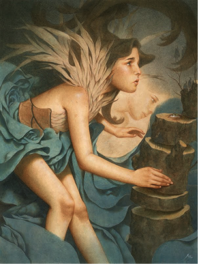 Tran writes, “I'm absolutely enamored with creating art that parallels dreams and experiences. My endeavor is to interpret someone's circumstance and transcribe it visually, illustrating my interpretation of their mindset.” Strange elements featured in her illustrations, such as displaced miniature sail boats, a tornado of diamonds, and fluttering kites anchored by an exposed brain, are not haphazard when considered part and parcel of a subject’s psyche. The artist’s works are technically methodical. Tran elaborates: “Preliminaries often take about 2-4 days. Once a final sketch is made, it's then transferred via a light table to Rives paper and general colors are laid down with glazes of acrylic. After it dries, I'll go back and begin noodling in the details with color pencils. Lastly, I'll alternate back and forth from acrylics to color pencils till I achieve a smooth gradient finish to the rendering. Working traditionally has its limitations – it's messy, sometimes toxic, and slow, but happy accidents are worthwhile moments.” 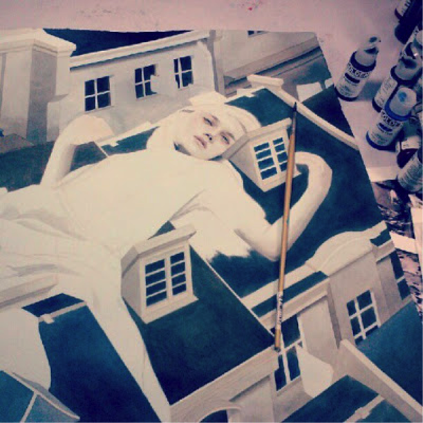 Drawing inspiration from Klimt, the artist splices flat shapes and ornamental patterning with fully rendered figures. Geometric shapes are used to further the sense of surrealism. She explains, “The picture plane expands and allows the viewer to understand the vast void that these figures are cast into. Ironically, they add dimension to the painting.” This space is the mind’s landscape – a mental nexus of the internal and the external. This is why the images are so incongruous. Tran reveals, “I would like to dine with Klimt, pick his brain a little, and figure out what his paintings truly meant.” Perhaps with Tran’s works, it’s not the meaning that we’re meant to channel but simply, how they make us feel. 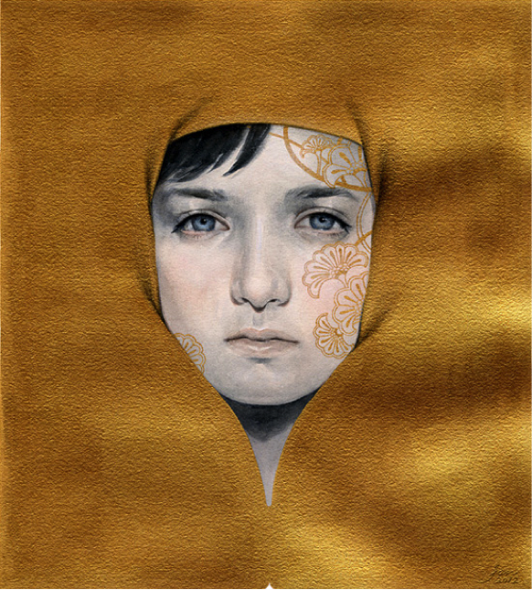 When I ask Tran about whether the emotion emanating from her paintings comes about organically or intentionally, her response is unwavering: “Yes, I’m very deliberate.” Pathos is built up purposefully but also delicately. Mainly, it’s retrospective – the emotional byproduct of reflecting back onto past experiences. The series “A Place Procured From Our Yesteryears" is about nostalgia. It depicts female figures, disproportionate to their surroundings, resting like sleeping giants in deserted residential towns. The series is an elaboration from a piece done by the artist for a previous show titled, "The Synapse Between Here & There”, where here refers to the present moment and there, the past. 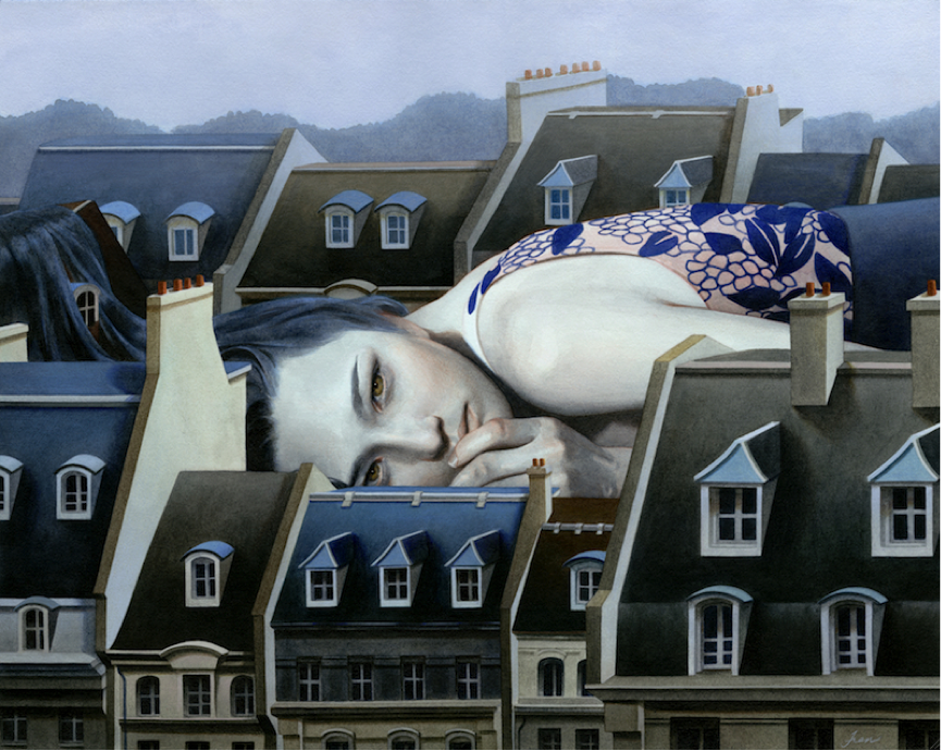 Tran’s illustrations are dreamlike and peaceful but also melancholic and forlorn. In “Nestled Within a Pallid Conviction”, a young female is cocooned in individually rendered, overlapping discs. Two porcelain Ingres-like hands protrude, anxiously clasped together and slightly shielding her face, suggesting an introspective, self-protective mood. Three expressionless birds peer out through black eyes. 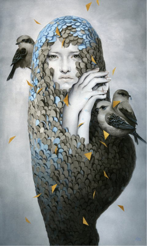 I ask Tran whether she considers her works optimistic or pessimistic. She replies, “To the public viewer, I'm sure they would say the latter. I create imagery that conveys a melancholic notion but it's to evoke optimism. It's meant to allow them to relate on common grounds, embrace the adversity depicted, and leave with a settled mind. It's my hope that the imagery can help the viewer come to a resolution.”
Ultimately, Tran intends the viewer to see themselves in those she depicts, so that they can find solace in shared feelings of endurance and suffering. She writes, “It's ubiquitous to say that life is a series of hardship. It's my hope that the viewer can relate, recollect, and thus foster wellbeing from what they interpret.” She hopes that the outcome is therapeutic for the viewer. Tran draws inspiration from Bruce L. Moon's book, Art and Soul, which explores the notion that creative expression, especially art, can help people overcome feelings of futility and emptiness, the basis of existential anxiety. One’s response to art is, for Tran and Moon, tantamount to the artwork itself. Tran’s paintings are subtly, and sometimes unsettlingly, evocative. We can relate to the emotion-centric fables because they are commonplace in a deeply human way. Channeling this, Tran states that she intends for her art to have a practical, human application: “Years down the line, I hope to collaborate with a hospital in producing art for their patients. I want to research and find ways to create imagery that somehow advocate well-being, mental nourishment, or simply distract the patient's mind as they heal.”
0 Comments
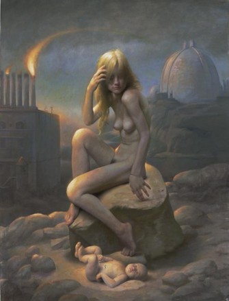 ‘In the evening there’s also a beautiful view of the yard, where everything is deathly still and the street-lamps are burning and the sky above full of stars.’ – Vincent Van Gogh With its dimly lit interior gilded with artistic and historical treasures of a time past but hopefully not lost, New York’s National Arts Club was an apt venue for its recent exhibition, ‘Nocturnes: Romancing the Night.’ Originally coined by James Abbot McNeill Whistler, the term ‘Nocturne’ refers to paintings that depict subtle light or twilight, a light effect that often evokes an eerie, dream-like atmosphere or other-worldliness. But while some works on display glowed with the half-light of dusk and ephemeral thought, others lacked depth and emotional pull. It thus came as a surprise that Michael Gormley, Editorial Director of ‘American Artist’ magazine and former Dean of the New York Art Academy, had curated the show, carefully hand-picking those who would exhibit as a group, considering how noticeably disparate it was. Given that Gormley had selected artists at different stages of their careers – ranging from established artists to fresh-out-of-art-school enthusiasts – the result was an obvious juxtaposition of varying technical capabilities. Disappointingly, a few works read as studies at best rather than fully realized artworks. (Placing tokenistic visual ‘motifs’ – a word overused by artists and critics – beside a female nude does not automatically upgrade what is basically a study to an exhibition piece.) Add to this an inevitably interpretable theme, and the show was almost destined to be incohesive. As a result, an eclectic mix of subject matter lined the walls – from babies to urban and natural landscapes, animals (primarily feline) and a tonne of female nudes. The diversity in artists’ interpretations of the theme was interesting to observe, but some works were so tenuously linked to the Nocturne genre that they seemed completely out of place. Mel Odom’s ‘Briget’s Guests’, for example, an illustration of a black-haired white-faced doll holding a bouquet of metallic Christmas decorations and surrounded by cartoon skeletons, read as a quirky, slightly disturbing animation. The glossy work was appealing in its own right, but appeared dislocated from the rest of the show. Similarly, Jason Yarmonsky’s ‘Reclining Dining’, a painting of his grandma strapped into a Wonder Woman costume contemplating a pillbox, just wasn’t the right fit. Neither work seemed to say anything tangible, nocturne or otherwise. Of course, as an artist, hitting the ‘sweet spot’ that occurs at the nexus of artistic concept, technique and expression is never an easy task. And yet a few artists did achieve this. Particularly impressive was Stephen Early’s ‘Wanderlust’ wherein eight male and female nudes hang languidly over a translucent wall of scintillating dark purples and deep greens. The figures appear heavy with slumber but their visceral, brightly-lit bodies render them with a blazing vitality suggesting anything but lethargy. In depicting the intersection of darkness and light, of unconsciousness and alertness, merging them in energetic sleep, Early’s ambitious painting conceptually and tonally captures the spirit of the Nocturne genre. An even eerier Nocturne mood was summoned in Odd Nerdrum’s primeval dreamscape, ‘Stranded’. A peasant-looking woman clasping a baby is asleep at the shoreline of a boundless murky sea. The landscape is barren, and the space empty and vast. In what could be an homage to Raphael’s ‘Mother and Child’, or an ironic, disturbing twist of it (are the figures eternally asleep?), the duo are bathed in a golden light that veils the huge canvas in a muted mid-tone. In omitting any possible chiaroscuro effect, Nerdrum avoids tonal contrasts that may be jarring or detracting from the serenity and stillness of the sleeping subjects. The same admix of maternal bonding and ominousness appears in Adam Miller’s stunning painting, ‘A Gentle Breeze’. A nymph-like female nude is centred in a post-apocalyptic setting. Her pearlescent flesh is backlit by a subtle rainbow of high-key light. Behind her in the distance stand the Acropolis of Athens and the Dome of St Peters, paired with a factory whose pipes are aflame. Amidst geological rubble lies a child at her feet, who like the decaying surrounds looks more dead than alive. Many works expressed feelings of vulnerability and the relinquishment of control, affiliated perhaps with uninhibited dream-states and subconscious activities concealed by half-light. In Alexander Rokoff’s ‘Harvest’, a young woman is obliviously carried away from her forest bed by a fleet of men, playing out a kind of mythical fantasy or nightmare depending on the viewer’s perspective. The same could be said of Thomas Woodruff’s imaginative painting of a white tiger being adorned with a pearled veil by a silver owl (titled ‘Tiger Variation Phlegmatic’). These works among many were heavily allegorical, featuring motifs associated with darkness, dreams and mythology. Yet, so many works were allegorical – relying on symbols and characters to represent ideas of principles – that the key feature of the original Nocturne paintings was somehow subverted: the visual effect of light. When we revisit some of the original Nocturne paintings, the prominent subject matter is not myth, allegory or nudes for that matter, but light itself. Take for example Whistler’s atmospheric painting ‘Nocturne in black and gold’ (1870). A falling rocket is described through tone alone, as bright flecks of light scintillate across a dark plane. The blazing rocket is suggested through the real focus of the piece – a dynamic combustion of light and movement. In the more modern words of artist James Turrell, ‘Light is not so much something that reveals, as it is itself the revelation.’ An incredibly evocative and expressive visual effect, light can arouse emotion and allegory in its own right, a fact that was unfortunately not exploited enough by many of the exhibiting artists. Ironically, in choosing a theme that glorified light itself, Gormley gave artists a ‘carte blanche’ to paint whatever they so pleased, as long as they actually did foreground luminosity. Artists had the opportunity to express light in all its myriad effects – through moonlight, dusk, twilight, shadow, fire, and any other infinite combinations of incandescent shifts of darkness and light. It makes sense that so many traditional Nocturne paintings were of landscapes and night skies. Why there were then so many paintings of naked women in the show evades me. Whistler and so many of his contemporaries proved that a simple, sobering depiction of the sky at night can be as captivating and atmospheric as any other subject, nudity included. While some works were genuinely impressive and meaningful, the show overall would have felt less contrived and more unified had artists taken the time to truly engage with the subtler essence that makes Nocturne paintings of the past so compelling. Harriet Levenston 2013 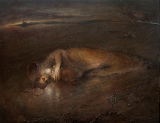 'Stranded', Odd Nerdrum
 There’s something deeply powerful and captivating about Brooklyn-based painter David Jon Kassan’s paintings. They’re the kind of works that stop you in your tracks, suspending you before them. This is in part due to the technical skill that they clearly showcase – it’s almost inconceivable that a person can reproduce, out of paint, so realistic an image as Kassan does. But mostly we are drawn into the works and held there because they so poignantly strike a chord with the viewer, resonating on a raw, emotional level.
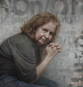
More than simply replicating his subjects Kassan seeks to understand them, acting as an empathetic intermediary between what he sees and what he creates. He carefully observes and reproduces every nuanced indication of his subject’s appearance, feeling and personality. In so doing, he incites a connection between the subject and viewer, opening up an interface with which he is conscious not to interfere. You won’t find loose, messy brushstrokes that you see in a lot of contemporary works because Kassan’s concern doesn’t lie in the visual appearance of paint in-itself. Instead he aims to control the medium of oil paint so that the subject is preserved in their pure essence. Charles Hawthorne, founder of the Cape Cod School of Art, said it best when he stated: ‘The only way a painter can appeal to humanity is to show people more – more than they already see, and he must show them with so much human sympathy and understanding that they will recognise it as it they themselves had seen the beauty and the glory.’ Looking at Kassan’s work, one is captivated by powerfully expressive hands, pensive faces, and flesh that appears warm to touch. Our gaze transcends the picture plane and permeates deep into the subject’s psyche. Consider Kassan’s portrait of his mum: Her curved back leans over as she sits calmly in side profile. Propped up on faded jeans, her elbows lead upwards to veiny hands and interlaced fingers. These hands alone provide insight into this woman’s persona and the life she’s lived so far. Behind her is a concrete wall, indented and stained with signs of wear and tear that come with age. Its rough fresco-like surface is contrasted with the woman’s soft, palpable face, around which cascades wispy hair tinted ginger and white. She appears a strong woman, with her tilted head decisively turned to face the viewer. Her eyes stare backwards and outwards, fixated on a point to the left of the viewer and beyond to a virtual horizon. It’s as if she is reflecting back on her past while at the same time pondering an inevitably unfolding future. Youth, aging, life and death circulate in Kassan’s works. His paintings feature sitters spanning across ages, ranging from young, radiant nudes to stoic, dignified elders. In each case, Kassan’s paintings seem to rise and fall with the steady, heavy breath of his sitters, serving as kinds of visual representations of weighty streams-of-consciousness comprised of past experiences, memory and introspection. In his self-portrait, Kassan himself appears deep in thought, with eyes downcast and head lit from above by cool, white daylight. There’s a sobriety and shamelessness to those depicted, no matter what their age, and in turn we feel towards them an admix of sympathy and compassion, pity and respect. Most importantly, we can identify with them. Kassan’s representational realist style is in this way two-fold: His technical mastery of the medium of oil paint combined with highly adept draftsmanship enables him to fluently represent what he sees. But unlike the cold mechanical mimicry of photography, Kassan’s realism is grounded in the realness of emotion and feeling emanating from his portraits. In comparison to a photo’s uniformly glossy surface, there’s a rich tangibility to Kassan’s work due to a process of intensive and careful layering, as seen in the stunning flesh tones he achieves. Kassan builds up layers of translucent oil paint to form a lattice of veins, blood and skin through which light enters and is reflected, rendering his subjects with a veridical luminosity. The smoothness of flesh is contrasted with areas that have been sanded back and reworked, causing textural accents to play across the surface of the painting. This is just one example of the inherent contradictions in Kassan’s work, which oscillates between representation and transformation, reality and abstraction. We see this in his backgrounds, which are graphic and fragmentary, reminiscent of the work of Franz Kline and Robert Rauschenberg, and yet are at the same time highly refined ‘trompe-l’oeil’ texture studies. The splicing of formalistic abstraction with realism is the result of the marriage of Kassan’s experiences as both graphic designer and painter. Kassan is constantly intrigued by the abstract visual elements his urban surrounds. Broken lettering, billboards patterned with remnants of faded, multi-coloured flyers, grids of hard architectural lines, shapes and numbers, all inspire the strong design elements underpinning Kassan’s work. The artist’s inclusion of flayed urban exteriors in his paintings invites the viewer to appreciate that which is typically overlooked and deemed mundane. But these surfaces are also symbolic. Weathered, graffiti-marked walls, dissected by peeling paint and torn down posters, serve as descriptive patinas. Like the figures before them, these surfaces import a sense of history, wherein the past, present and future culminate. Time is an unbroken continuum of experience, change, growth and decay, and both subject and background are visceral embodiments of this process. Kassan explains that his artistic practice consists in taking the time to aesthetically appreciate life on a micro-level: ‘My work is a way of meditation; of slowing down time through the careful observation of overlooked slices of my environment.’ Ultimately, there’s a truth and timelessness to Kassan’s work because it is deeply human. His paintings resonate with the fragility and heaviness of life, delivering the message momento mori: remember your own mortality. Those featured in his work are distilled in an exact moment in time, patiently contemplating their present. We share in this present-moment appreciation, this slowing down of time, and see life for what it is. Kassan’s up and coming show ‘Solitudes’ will on display from 13 September at Gallery Henoch in New York. View his works and bio at http://davidkassan.4ormat.com. Harriet Levenston 2012 A bad performance overall is an utter letdown; but there’s nothing more disappointing than neutrality. At least in the case of the former, some degree of emotion is enlivened, albeit negative. The exhibition currently on display at the 4A Centre for Contemporary Asian Art, titled ‘Variable Truth’, was unfortunately more flat-line than variable, and here’s why:
Like most concept-heavy shows, although a lot of the works featured have undoubtedly evolved from extensive conceptual development, they nonetheless fell short of the mark aesthetically. The show aims to present varying artistic perspectives of Australia’s role within the Asia-Pacific region, responding to such personally and politically rich issues as the nation’s social history, geographical significance, globalisation and the burgeoning Eastern economy. It also aims to illuminate how a change of perspective often triggers a change in historical commentary – art theory included. And these issues are all complex and interesting, but as concepts alone, they are not art. Relying predominantly on a concept as an artist is always a dangerous move because if the viewer struggles or fails to grasp it, and the work is not aesthetically strong enough to stand alone as a source of visual engagement, then the work may ultimately mean and say nothing at all. This conundrum surfaced in artist Brook Andrew’s ‘Flowchart’. Eight fluorescent tubes inter-crossed at small, aged postcards. I stood before it initially intrigued, but after a minute or so, I felt mostly underwhelmed. The title and the postcards hinted at it being something historical, or personal, or both in some modern take on a family tree. But the link between giant glow sticks and tea-stained images appeared arbitrary, which deducted as opposed to added meaning to the work. Such works could be redeemed if accompanied by a conceptual breakdown, elaborated by the artist, and at the viewer’s disposal. Rebutting, hypothetically, that it is the artist’s intention to ‘leave the work open to interpretation’ is viable but only if there is at least some tangible opening for intellectual follow-through. Otherwise, the viewer is left standing there before a work, either desperately devising their own pompous over-analysis or half-yawning as they pivot away. The works upstairs were comparatively more engaging, but on the whole were not polarised towards the really bad or the really good. They were, I’d say, settled smack bam in the middle of a mediocre continuum. This is not to deny the conceptual richness of the works, but in viewing them as works of art not academia, they just didn’t excite the eye. However, one work which seemed to stick out from the rest was Greg Semu’s ‘The Assassination of Atai’ – an evocative, large backlit digital print in a dark room. It featured three men in tribal attire forcefully pinning down another man with a rifle pressed against his temple. The man’s outstretched arm was clenched by his captor’s blood stained hands and his eyes bulged with fear. The scene was clearly staged, but deeply haunting and visceral nonetheless. In complete contrast were two other works, both featuring miniature paper models of architectural structures. If not powerful, these works were at least quaint and playful. Artist Melissa Howe had printed, folded and kitted out a paper replica of her strikingly kitsch family home, built in the 1970s on the outskirts of Canberra. Peering into the rooms and observing the detail of such features as a velveteen sofa, stuffed toys, a bowl of tropical fruit and quintessentially mod wallpaper and matching curtains was an uncanny experience. The other work, ‘After Humans’, by architect-turned-artist Michael Lee was a series of photographs depicting paper constructions of famous monuments. The models were coloured and illustrated in painstakingly veridical detail. A human hand is shown playfully interacting with them – lifting, plucking, tipping over and crushing the Arc de Triomphe, Big Ben and the Statue of Liberty, to name a few. Another work also dealing with destruction was by Sydney-based artist Tim Silver. Fragile sculptures made of spices were documented photographically as they incrementally disintegrated on the water’s edge, including a Rolex watch made of ginger, a nutmeg Coke can and a sandalwood TV remote, not to mention a disintegrating Croc shoe. The idea was simple but surprisingly arresting. Which is more than I can say for the adjacent work: garishly coloured wallpaper in Macdonald’s red and yellow had been applied from floor to ceiling. It featured a repeat of cartoon faces of aboriginal children and the word ‘DEADLY’. The theme – if you can call an assault on the eyes a theme – was continued in two large posters packed full of pop references, mainly of manga super hero characters. I didn’t quite ‘get’ the work, so I consulted the catalogue. When it comes to art, there’s always something about a group show that doesn’t quite fit. Either the bodies of work are so distinct that the show feels fractured, or, the artworks are similar to the point where it’s hard as a viewer not to judge them side by side and implicitly draw a winner. ‘Variable Truth’ had good intentions, but was unfortunately flooded by neither goodness nor badness, but worst still, mediocrity. Harriet Levenston 2012 ‘Variable Truth’ is currently showing until 14 July at A4 Gallery, 181-187 Hay Street, Sydney 2000. ANIMA RISING
JAMES GUPPY ‘FROM THOSE DEEP DARK SPACES WITHIN... WHERE TALES BEGIN, I OFFER THESE.’ EMERGING FROM DARKNESS WERE THE VISCERAL SCENES OF MYTHOLOGY, INTIMACY AND MAYHEM COMPOSED BY ARTIST JAMES GUPPY IN HIS MESMERIZING SHOW, ‘ANIMA RISING’. GUPPY’S PAINTINGS WERE QUIETLY PROVOCATIVE. BASE, DARK AND FANTASTICAL, THEY EXPLORE THE UNDERBELLY OF HUMANITY THROUGH THE SUPPLEMENTARY REALM OF MYTHOLOGY. THE FIGURES IN THE WORKS HAVE BEEN SUMMONED FROM THE ARTIST’S SUBCONSCIOUS AND CHILDHOOD MEMORIES TO THROW LIGHT ON THE COLD DARKNESS OF RATIONALITY. GUPPY HAS ALWAYS FELT AT HOME IN THE WORLD OF FAIRYTALES AND MYTHS, WHEREIN HE FINDS A POETRY AND A PASSION THAT PROSAIC HISTORY COULD NOT GIVE. HIS USE OF SCALE AND FIGURATION INVITE US TO TAP INTO LIFE’S SUB-STRATA: PART MEMORY, PART DREAM, PART PORTENT. AMONG THE MYTHOLOGICAL CHARACTERS WERE ROBUST, AGED WOMEN. IN MOST WORKS, THEIR SAGGING FLESH WAS BOUND BY ROPES AND ENCRUSTED IN A THIN SHELL OF PLASTER. THEIR HAIR WAS LONG AND GREY, THEIR BREASTS PENDULOUS AND THEIR FACES DEFIANT. IN SOME WORKS, PARTICULARLY ONE IN WHICH A NAKED FIGURE CONTORTS IN MID AIR, THE SUBJECTS COULD HAVE EASILY BEEN MISTAKEN FOR MEN. THESE WOMEN WERE NOT BEAUTIFUL. IN FACT, THEY WERE IN MANY WAYS SEXUALLY REPULSIVE, AS CONFIRMED BY VIEWERS’ APPROACH-AVOIDANCE OF THE WORKS. BUT THEY WERE POWERFUL, AND I HAD A REAL SENSE THAT THESE WOMEN COULD BE DEPENDED ON FOR GUIDANCE AND PROTECTION. THESE WERE NOT THE PREDICTABLE SEDUCTRESSES BUT RATHER THOSE TYPES THAT SOCIETY TRADITIONALLY FEARED AND MARGINALISED: THE WITCH, THE CRONE AND THE FURIES. THEY WERE THE STRONG, EXTRAORDINARY WOMEN WHO OFFER THE POSSIBILITIES OF OTHER LIVES. GUPPY’S PAINTINGS ARE A REFRESHING REMINDER OF THE CHOICES SOME ELDERLY WOMEN ARE MAKING TO SUBSTITUTE BOTOX FOR SELF-ESTEEM, REFUSING TO SUBMIT TO SOCIAL PRESSURES OF ANTI-AGING AND APPEARANCE-ORIENTED PRAISE. FOR MANY WOMEN, RELINQUISHING THESE PRESSURES EQUATES TO NEWFOUND FREEDOM AND SELF-EMPOWERMENT. THERE ARE ACTUALLY CONTEMPORARY ‘CRONING CEREMONIES’, WHEREIN IN POST-MENOPAUSAL WOMEN CONGREGATE TO HONOUR THEIR ACCRUED MATURITY. IN EARLY CULTURES AND IN WICCA AND PAGAN RELIGIONS, THE FEMALE ELDER WAS CONSIDERED A WISE WOMAN. SHE WAS THE HEALER THE TEACHER, THE IMPARTER OF KNOWLEDGE. THROUGH THESE CEREMONIES WOMEN ARE RECLAIMING THE NAME OF THE CRONE (ALSO DEROGATIVELY TERMED ‘OLD HAG’) IN A POSITIVE WAY. THE CRONE FIGURE WAS FEATURED IN NEARLY ALL OF GUPPY’S PAINTINGS. IN ‘AN EMBRACE OF SWALLOWS’, A NUDE RECLINING WOMAN IN THE BALLPARK OF SIXTY, CARESSES THE HEAD OF A NAKED MAN. LYING STOMACH DOWN ON DARK EARTH, THE MAN LOOKS UP TO THE ELDERLY WOMAN, CHILDISHLY, AS IF SEARCHING FOR MATERNAL COMFORT. SWALLOWS ENCIRCLE THE WOMAN’S HEAD, WHICH IS ADORNED WITH BARK AND REEDS AND ILLUMINATED BENEATH A SPOTLIGHT OF COOL, WHITE LIGHT. HER HANDS LOOK MAN-LIKE, AS DO HER MUSCULAR ARMS, ESPECIALLY JUXTAPOSED WITH THE MEEKNESS OF THE MAN’S POSE, HIS HANDS LIKE LITTLE HELPLESS PAWS BENEATH HER GAZE. WRITING ABOUT THIS WORK DOES NOT DO IT JUSTICE. ITS ENORMOUS SCALE, THE HUGE EXPANSE OF DARKNESS THAT ENVELOPS THE FIGURES, AND THE UNUSUAL CONTRAST OF MUTED, EARTHY HUES WITH SHOCKINGLY VIBRANT COLOUR, REALLY SHOULD BE SEEN IN THE FLESH. GLISTENING FEATHERS, BOTANICAL GARLANDS AND MOTTLED, HEAVING, PURPLISH-RED FLESH PULSATED FROM OMINOUS BLACK BACKGROUNDS. THE LIFE-SIZE FIGURES WERE RENDERED HEAVY AND SCULPTURAL, EMBODYING IN THEIR FORM A WEIGHTINESS ATTRIBUTABLE TO HUMANITY ITSELF. ANIMALS WERE ALSO INTERWOVEN IN THIS DEPICTION OF HUMANITY, IN TOTAL SYMBIOSIS WITH THEIR HUMAN COUNTERPARTS. GUPPY WRITES: ‘I WASN'T INTERESTED IN DOMESTICATED CREATURES BUT IN THE WAY THEIR UNTAMED FOREBEARS MOVE WITHIN OUR PSYCHE. ANIMALS WEAVE WITHIN ALL OUR OLD STORIES, EXPLAINING OUR COMPLEX HUMANITY TO US.’ AN ECHO OF HIS FORMER SHOW, ‘FUR, FEATHER, SCALE’, THE PAINTINGS BURST WITH ANIMAL LIFE. IN ‘WING STUDY’, THE BODY OF A GOOSE HAS BEEN CROPPED SO AS TO SHOWCASE ITS SCINTILLATING ELECTRIC BLUE WING. BUT OTHER PAINTINGS WERE PARTICULARLY DISTURBING. IN ‘DEATH OF A MAIDEN’, A STANDING WOMAN WAS BOUND FROM KNEES TO STERNUM WITH ROPE. HER WHOLE BODY WAS A SILVERY-BLUE, AND TIED TO EACH HAND WAS A BUNDLE OF DEAD REEDS. HER WRITHING BODY WAS PROPPED UP BY A FIGURE STANDING BEHIND HER, WHICH YOU DON’T NOTICE AT FIRST. DESPITE IT APPEARING HUMAN, IT HAD THREE CANINE HEADS, WHICH ALL STARED DIRECTLY AT THE VIEWER. WHAT MADE THE WORK EVEN MORE UNNERVING WAS THE WOMAN’S FACE – WITH HEAD TILTED, SHE WAS SMIRKING, HER EYES FIXATED ON YOU, SEEMINGLY ENJOYING THE DRAMATIC IMPACT OF HER OWN DEATH. IN ALL OF HIS PAINTINGS, THE ARTIST WANTS TO ROUSE US, AS HE REVEALS: ‘I FIND OUR DAY-TO-DAY REALITY UNTRUSTWORTHY. IT IS A BUSY ANAESTHETIC WE USE TO DISTRACT OURSELVES FROM ANXIETIES ABOUT DEATH, LONELINESS AND OUR MANY INADEQUACIES.’ HIS OBSESSION WITH MYTHOLOGY MAKES SENSE – OTHERWORLDLINESS PROVIDES A VIGILANT ANTIDOTE TO BOREDOM AND ACCEPTANCE OF THE RULES. DREAMLIKE AND MENACING, GUPPY’S WORKS PRODUCED AN UNSETTLING ALCHEMY, CHALLENGING US TO RE-EXAMINE SEDENTARY COMFORT ZONES AND ASSUMPTIONS. DESPITE THE SHOW’S MALEVOLENCE, WHEREIN BEAUTY AND LIFE HAVE BEEN PERMEATED WITH ANTAGONISM AND DEATH, THE WORKS WERE UPLIFTING AND COMPELLING. THE IMAGES FELT BOTH FAMILIAR AND STRANGE, AND AMIDST THE ALLUSIVE WORLD OF MYTHOLOGY EVERYDAY LIFE COULD BE DETECTED. AS MUCH FOR THEIR ADEPT TECHNICAL EXECUTION, AS FOR THEIR FASCINATING IMAGERY, THESE EXQUISITELY DARK PAINTINGS DEMAND TO BE SEEN. HARRIET LEVENSTON 2012 JAMES GUPPY’S WORKS FROM BOTH ‘ANIMA RISING’ AND ‘ANIMAL KINGDOM’ ARE VIEWABLE AT BRENDA MAY GALLERY, 2 DANKS STREET, WATERLOO, NSW, 2017. 5/8/2012 0 Comments drift, SHIMMERING ALUMINIUM WORKS BY BERLIN ARTIST BERIT MYREBØE
LAYERED, ALLUSIVE, REFLECTIVE AND IN FLUX, BERLIN ARTIST BERIT MYREBØE’S EVOCATIVE ALUMINIUM PAINTINGS IN HER RECENT SHOW, ‘DRIFT’, MIRROR THE EBB AND FLOW OF LIFE’S AMBIGUITIES. AT FIRST GLANCE, THE EXHIBITION LOOKED PRETTY SPARSE – GREY PANELS ON WHITE WALLS WASN’T PARTICULARLY ARRESTING. BUT UPON CLOSER INSPECTION, I NOTICED THAT OUT OF THE SILVERY SCREENS EMERGED REMNANTS OF WAVES, SKIES AND FACES. THERE SEEMED TO BE A LOT MORE THAN FIRST MEETS THE EYE. ‘HEAD #4’ DEPICTED TWO IDENTICAL FRAGMENTS OF A WOMAN’S NOSE AND MOUTH. BOTH WERE VISUALLY ERODED, FADING SUCCESSIVELY INTO AN EXPANSE OF ALUMINIUM. THE ECHO OF EACH IMAGE IN THE OTHER CREATED A SHIFTING EFFECT, WHICH REVERBERATED IN THE REMAINDER OF THE WORK. THE SURFACE, ALTHOUGH THREE QUARTERS BLANK, WAS FILLED WITH AFTERNOON LIGHT, REFLECTIONS OF ITS ARCHITECTURAL SURROUNDS AND THE INVERTED IMAGES OF OTHER WORKS. I WAS INTRIGUED BY HOW MUCH WAS ACTUALLY CONTAINED IN THE PAINTINGS DUE TO THEIR REFLECTIVE SURFACE QUALITY AND IN DESPITE OF THEIR INHERENT MINIMALISM. THIS WAS DUE LARGELY DUE TO MYREBØE’S USE OF POLISHED ALUMINIUM AS A SUBSTITUTE FOR CANVAS OR PAPER, AS WELL AS THE UNIQUE PROCESS INVOLVED. THE ARTIST HAS TRANSFERRED PHOTOGRAPHS ONTO REFLECTIVE PLATES ONLY TO THEN DEFAMILIARISE THEM BY OVERLAYING THEM WITH HIGHLY PIGMENTED OIL PAINT. DESPITE THE WORKS’ VISUAL AMBIGUITY, THEY STILL HAD A PHOTO-REALISTIC GLOSS TO THHARRIET LEVENSTON 2012. THE CHOICE OF MEDIUM DEFIES A LONG-STANDING ARTISTIC TRADITION NOT JUST MATERIALLY, BUT ALSO IN THE WAY THAT THE VIEWER IS INEVITABLY INCLUDED IN THE WORKS VIA THEIR OWN REFLECTION. STANDING BEFORE THE MIRROR PAINTINGS, I REALISED THAT I WAS IRONICALLY INSPECTING MYSELF AS MUCH AS I WAS INSPECTING THEM. SO OFTEN WORKS OF ART ARE THE OBJECT OF THE VIEWER’S GAZE. WE OBSERVE, INSPECT AND INTERROGATE THE PICTURE BEFORE US. IN ‘DRIFT’, YOU’RE UNAVOIDABLY A PART OF THE ARTWORK – ON DISPLAY, AND THE OBJECT OF YOUR OWN SPECTATORIAL INQUIRY. INVERTING THE VIEWER’S GAZE FUSES TOGETHER OBJECT AND SUBJECT. HERE, NO VOYEURISM GOES UNDETECTED. THIS ADDED AN ELEMENT OF CONFRONTATION, WHICH SAFEGUARDED THE DEPICTED FEMALE NUDES – OFTEN MYREBØE HERSELF, FROM BEING OBJECTIFIED. PENSIVE, INDEPENDENT AND ALONE, THE FIGURES ARE DEMAND TO BE TAKEN SERIOUSLY. IN THIS WAY, THEIR NAKEDNESS WAS NOT EROTIC BUT PRESENTED AS SELF-RELIANT AND NATURAL. NUDITY ASIDE, THERE WAS A NUMBER OF OCEAN-THEMED PAINTINGS, WHICH DUE TO THE LUMINOSITY OF THE SILVER PANELS, GLOWED WITH AN EVOCATIVE SENSE OF REALISM AND DEPTH. IN ONE PARTICULAR DIPTYCH TITLED ‘THE TIDE’, AN ERODED SUPERIMPOSED PHOTO OF DARK, TURBULENT WAVES GLISTENED WITH NATURAL LIGHT. AS YOUR VANTAGE POINT SHIFTED, SO TOO DID THE WORK’S REFLECTIONS. THIS INTERPLAY OF LIGHT COMBINED WITH THE SWIRLING OCEAN CURRENT CREATED A GENUINE SENSE OF MOVEMENT; THE SCENE LOOKED AND FELT REAL. THIS WAS KIND OF IRONIC, GIVEN THE MINIMALISTIC AND OBSCURED IMAGERY FEATURED IN THE PANELS THAT WERE FOR THE MOST PART, HALF BLANK. NOT AN AVID FAN OF MINIMALIST OR ABSTRACT ART, I SUSPECT THAT IF THE WORKS HAD NOT BEEN ON A REFLECTIVE SURFACE, THEY WOULD HAVE LOOKED FLAT AND UNFINISHED. AT WORST, THEY MAY HAVE EVEN RESEMBLED THOSE HIDEOUS ‘GESTURAL OCEAN SCENES’ THAT BEACHSIDE MOTEL OWNERS SEEM TO BUY IN BULK. THANKS TO THEIR METALLIC REDEMPTION, THE WORKS ESCAPED THIS FATE, AND OFFERED THE VIEWER LAYERED, CONVINCING AND BEAUTIFULLY ALLURING SCENES. THE SILVERY PANELS WERE ALLURING BECAUSE BENEATH THEIR SHIMMERING SURFACE, THEY WERE OMINOUS, ETHEREAL AND DARK. PHOTO-REALISTIC IMAGES WERE VEILED BY DISFIGURING PAINTS STROKES, REFLECTIVE PATCHES, AND THEIR OWN ABSENCE. THE IMAGES SLID IN AND OUT OF FOCUS AND THE VIEWER WAS OFFERED ONLY AN AFTER-IMAGE OF WHAT THEY WERE SEEING. THIS AMBIGUITY TIED THE WORKS TOGETHER, AS IF TO HINT AT THE EPHEMERAL, INTANGIBLE NATURE OF LIFE’S CONTENTS: PEOPLES’ HIDDEN SIDES, UNANSWERABLE METAPHYSICAL QUESTIONS, AND OUR ALLUSIVE SUB-CONSCIOUS. IMPERMANENCE AND AMBIGUITY UNSETTLES US, BUT IT’S WHAT MAKES LIFE SO DYNAMIC. AT LEAST THIS IS WHAT JAPANESE PHILOSOPHY HITS ON WHEN IT DRAWS A LINK BETWEEN IMPERMANENCE AND BEAUTY. ONE PHILOSOPHER NAMED KENKO WROTE, “IF A MAN WERE NEVER TO FADE AWAY LIKE THE DEWS OF ADASHINO, NEVER TO VANISH LIKE THE SMOKE OVER TORIBEYAMA, HOW THINGS WOULD LOSE THEIR POWER TO MOVE US! THE MOST PRECIOUS THING IN LIFE IS ITS UNCERTAINTY.” THE SUBJECT MATTER OF MYREBØE’S WORKS SHIMMER, FADE, REVERBERATE AND SLIP AWAY FROM US AS MUCH AS THE TRANSITORY REFLECTIONS IN THEIR MIRRORED SURFACES DO. AND IN THIS UNCERTAINTY WE RECOGNISE BEAUTY. REDEMPTION BY ALUMINIUM, ‘DRIFT’ IS DEFINITELY WORTH A VISIT. HARRIET LEVENSTON 2012 ‘DRIFT’ IS ON DISPLAY UNTIL AT THE DOMINIK MERSCH GALLERY, 2 DANKS STREET, WATERLOO, NSW. A LOOK AT SYDNEY ARTIST, ASHLEY FROST
SLABS OF PAINT – BLUE ON BURNING RED ON NEON ORANGE ON COOL VIOLET ON BLACK – FORM THE THICK, TEXTURAL RELIEFS OF ARTIST ASHLEY FROST’S VIVID CITYSCAPES IN HIS CURRENT SHOW, ‘URBAN PATINAS’. TO FROST, CITIES ARE CURIOUS AND VIBRANT PLACES, SITES OF MODERNITY AND THE HUB OF CONTEMPORARY LIFE. FASCINATED BY INTERSECTIONS, WHERE THE CITY’S PERIPHERY CONVERGES WITH THE INNER SUBURBS AND THE MOMENT WHERE DAY EXHAUSTS ITSELF AND BECOMES NIGHT, HE SHOWS US THAT THERE IS BEAUTY TO BE FOUND IN THE URBANE. ENTERING THE GALLERY SPACE, YOU’RE HIT STRAIGHT AWAY WITH HOT BURSTS OF COLOUR. WHITE WALLS PULSATE WITH LARGE-SCALE AND INTIMATELY SIZED CANVASES WHICH ACT LIKE WINDOWS THROUGH WHICH A LIVING, BREATHING – PANTING – CITYSCAPE IS IN CENTRAL VIEW. ‘VARICOSE’ – ALMOST 4 METRES SQUARED – IS A GESTURAL PERSPECTIVE OF A ROAD LINED WITH SHOP FRONTS SOMEWHERE IN SYDNEY. THE PAINT HAS BEEN APPLIED SO THICKLY AND FREELY, THAT THE SCENE VERGES ON ABSTRACTION. DENSE BRUSHSTROKES HAVE BEEN TROWELED BACK TO ALLOW POCKETS OF FLUORESCENT RED-ORANGE TO SURFACE AND MERGE WITH A GLOWING SUNSET. SKY AND CITY REVERBERATE WITH ENERGY, WHICH IS AT THE SAME TIME ENLIVENING AND EXHAUSTING TO VIEW. THERE IS A REAL SENSE OF MOVEMENT WITHIN THE WORK, CIRCULATED BY THE RUSH OF SCINTILLATING COLOUR, UNDULATING ROAD LINES AND EXPRESSIVE, AGGRESSIVE, BRUSHSTROKES. IT FEELS LIKE A HUMID, HAZY WORKDAY AVO ON KING STREET. SMALLER WORKS REVEALED COOLER, SOMBER, MORE SUBDUED NIGHT SCENES. IN ‘ENTROPY STUDY’, AN OMINOUS NAVY SKY IS FRINGED WITH THE SILHOUETTE OF A DARK CITYSCAPE. PALLID YELLOW GLARE RADIATES AT THE POINT WHERE CITY AND SKY CONVERGE, AND IS ECHOED IN FLECKS OF THE DIM LIGHT OF STREET LAMPS. THE SCENE IS FILLED WITH URBAN REMINDERS: POWER LINES STREAK ACROSS BUILDING FACADES, DRAWING THE EYE ALONG ASPHALT TO SMOG. SLICES OF COLOUR CUT THROUGH BLACK SHAPES, SUGGESTING ILLUMINATED SHOP AWNINGS, CAR BRAKE LIGHTS, METALLIC ROAD SIGNS AND A WET ROAD REFLECTING THE EVENING SKY. IT’S AN INTIMATE VIGNETTE OF THE CITY AT DUSK, WHERE THE WORKDAY CLOCKS OFF AND RESPITE IS FOUND BACK AT HOME, PROBABLY BEFORE THE LULLING GLOW OF THE TV. WHETHER FROST IS SAYING SOMETHING DEEPER ABOUT SUBURBIA, ABOUT WHAT LIES BENEATH ITS PATINA, IS UNKNOWN. YET IT IS CLEAR THAT THROUGH HIS IMMENSELY LAYERED, VISCERAL, EXPRESSIONISTIC PAINTINGS, FROST IS EMPHASIZING THE RICHNESS AND INVOLVEDNESS OF CITY AND URBAN LIVING. THE SURFACES OF THE WORKS, REPLICATING ALSO THE PATINA OF THEIR SUBJECT MATTER, HAVE BEEN SCRAPED BACK, REWORKED, EMBELLISHED AND DEVELOPED. THE RESULT IS A RAW, WORN, LIVED-IN FEEL. THE WORKS’ SURFACES HAVE A HISTORY TO THEM, ONTO WHICH A PRESENT AND A FUTURE HAVE ENCRUSTED. AND THIS IS EXACTLY WHAT AN URBAN PATINA IS THE RESULT OF – ACCUMULATED HISTORY, CHANGE, CONSTRUCTION, AND DAMAGE AS SIGNS OF AGING. BUT PATINA, ALTHOUGH THE CONSEQUENCE OF CORROSION AND EXPOSURE OVER TIME, IS ULTIMATELY A POLISHED, UNIQUELY BEAUTIFUL SURFACE. LIKE METROPOLISES AND SUBURBAN DWELLINGS, PATINA’S UNIQUENESS IS REMINISCENT OF ITS WEAR AND TEAR. ANYTHING AND EVERYTHING IN URBAN LIFE CULMINATES, HEAPS UP, INTERACTS AND INFORMS ITS OUTER FORM. THIS CULMINATION IS ECHOED IN THE WORKS, WHEREIN RIGOROUS BRUSHSTROKES COLLIDE AND CONTRASTING COLOURS CLASH, BUT IN A WAY THAT IS SURPRISINGLY MORE HARMONIOUS THAN GARISH. FROST DEFINITELY PUSHES COLOUR BOUNDARIES TO THE EXTREME, GOING AGAINST THE GRAIN OF COLOUR THEORIES WHICH PREDICT WHAT WILL AND WON’T LOOK VISUALLY APPEALING. IN ‘FLIGHT PATH STUDY 1’, LAYERS UPON LAYERS OF VIOLET AND VARIOUS SHADES OF BLUE HAVE BEEN BRUSHED OVER A BRIGHT ORANGE BACKGROUND, WHICH PERMEATES THE SKY. THE ELECTRIC CONTRAST CRACKLES BEFORE YOU LIKE AN OPEN FIRE. THE DEEP PURPLE HORIZON LINE IS IS MET BY A WINDING COBALT ROAD SWOOPING ROUND FROM THE FOREGROUND. PINK CARS SPEED PAST MAGENTA FOOTPATHS. NO ELEMENT ESCAPES FROST’S OBSESSIVE COLOUR TREATMENT – EVEN ELECTRICAL POWER POLES ARE STREAKED A MUTED RAINBOW. IT’S EXCITING TO SEE SUCH A COLOURFUL TRANSLATION OF WHAT WE USUALLY DEEM MUNDANE, INDUSTRIAL AND UGLY. FOR AS MUCH AS FROST EXPLORES AND DISPLAYS ‘URBAN PATINAS’, HE EXPRESSES A REAL FASCINATION AND ENJOYMENT OF COLOUR AND TEXTURE. ‘FERRY STUDY’ IS SO ABSTRACT, THAT WITHOUT THE CLUE OF ITS TITLE, IS FUNDAMENTALLY A HAPHAZARD PATTERN OF COLOUR AND LIGHT. YOU’RE MADE TO FOCUS ON THE MATERIAL QUALITIES OF THE WORK – ON THE DENSE SMEARS OF IMPASTO PAINT, WHICH HAVE BEEN ETCHED INTO WITH A PALETTE KNIFE, FINGERTIPS AND THE END OF A PAINTBRUSH. IT’S A VERY INVOLVED, HANDS-ON APPROACH TO PAINTING WHICH ARGUABLY OBSCURES THE BOUNDARY BETWEEN PAINTING AND SCULPTURE. FROST HAS ENERGETICALLY SLAPPED ONTO CANVAS AND BOARD A MULTIPLICITY OF IMAGES FROM HIS TRAVELS, RANGING FROM SKYSCRAPERS IN NEW YORK TO ICE CAPS IN ANTARCTICA. ALL OF HIS WORKS REVERBERATE WITH A LIVELINESS THAT’S UNRELENTING, EXCITING AND HIGHLY CONTAGIOUS. HARRIET LEVENSTON 2012. ‘URBAN PATINAS’ IS CURRENTLY ON DISPLAY AT THE STELLA DOWNER FINE ART GALLERY UNTIL 19 MAY AT 2 DANKS STREET, WATERLOO NSW. 3/8/2012 0 Comments Undercard, voilent impressionsVIOLENCE MEETS BEAUTY VIA SYDNEY ARTIST MATT GLENN
PICTURE THIS: FROM A BIRD’S EYE VIEW, A CAR TRAVELS ALONG A SUNLIT ROAD, FRINGED WITH COUNTRYSIDE. IN THE CAR, A FAMILY OF THREE IS SMILING, RELAXED, AND ENJOYING THE RIDE. THE MOTHER PUTS ON A CD, AND ALL OF A SUDDEN THE SCENE IS RUPTURED BY LOUD DEATH METAL, WHICH ONLY WE THE VIEWERS CAN HEAR. THE GUTTURAL SOUNDTRACK FORESHADOWS THE DESTINY OF THE FAMILY, WHICH IS TO BE KEPT HOSTAGE AND TORTURED TO DEATH BY TWO BORED TEENS. OBLIVIOUS, THE FAMILY’S STILL SMILING. THIS IS THE OPENING SCENE OF MICHAEL HANEKE’S ‘FUNNY GAMES’, AN AUSTRIAN THRILLER THAT I THINK IS BRILLIANT. IT’S BRILLIANT BECAUSE IT’S SO GORY AND YET SO SUBTLE, A COMBINATION THAT MAKES THE FILM DISTURBINGLY EERIE WELL BEYOND THE END CREDITS. BUT MY ADMIRATION OF THIS SADISTIC DISPLAY – IN ONE SCENE, THE CAMERA LINGERS FOR MINUTES ON A WALL COATED IN A YOUNG BOY’S REMAINS AFTER BEING SHOT POINT BLANK BY A RIFLE – STRIKES ME AS STRANGE. HOW COULD SOMETHING SO MACABRE BE SO INTRIGUING TO HUMAN BEINGS? PSYCHOLOGISTS REFER TO THIS AS THE VIOLENCE-PARADOX. IT’S A DEEPLY CURIOUS AREA OF THE HUMAN PSYCHE THAT REMAINS A MYSTERY AND IS EXPLORED BY MATT GLENN IS HIS RECENT EXHIBITION, ‘UNDERCARD’. GLENN’S FASCINATED WITH THE UNUSUAL FUSION OF VIOLENCE AND GRACE; HOW SOMETHING SO DESTRUCTIVE CAN APPEAL TO OUR AESTHETIC SENSE AS AN OBJECT OF BEAUTY. ON WHITE WALLS HUNG A SERIES OF WORKS, MOST OF WHICH AT FIRST GLANCE LOOKED LIKE MIRRORS. WALKING UP TO MY REFLECTION, HOWEVER, I NOTICED THAT IT WAS MARRED WITH BULLET HOLES. GLENN TOLD ME THAT THE WORKS HAVE ALL BEEN SHOT AT SHOOTING RANGES BY RANGE OFFICERS OR EX COPS. AS A RESULT, THE STAINLESS STEEL PANELS ARE LEFT JAGGEDLY PERFORATED. ANOTHER STAINLESS STEEL PANEL STRETCHING 2.4 METRES ACROSS THE WALL REFLECTED A BUZZING ROOM OF VIEWERS. THE LAUGHING, BULLET-HOLED REFLECTIONS REMINDED ME OF HANEKE’S SMILING FAMILY AND THE SINISTER MUSICAL OVERLAY. THE CONTRAST BETWEEN THE LIVELINESS OF THE SPACE AND THE INHERENT VIOLENCE OF THE WORKS HIT CLEVERLY ON THE DICHOTOMIES OF HAPPINESS AND SUFFERING, LIFE AND DEATH. THE POINT OF THE WORKS IS TO DISTIL THE DESTRUCTIVE SO AS TO MAKE IT AN OBJECT OF CONTEMPLATION. SUDDENLY SOMETHING MENACING BECOMES AN OBJECT OF CURIOSITY, NOT FEAR. IT IS A RARE CHANCE TO FIND SOMETHING OF BEAUTY AMONG THE CHAOS. SEEING MY BULLET-MARRED REFLECTION IN THE WORKS WAS LIKE OBSERVING MYSELF POSTHUMOUSLY, ENTERTAINING THE POTENTIALITY OF MY OWN DEATH. BUT BECAUSE THE MACABRE REFLECTIONS ARE WORKS OF ART, GLORIFIED IN BLACK FRAMES, THEY’RE DISCONNECTED FROM THE VIEWER. THE ARTIST LIKENS THIS SEPARATION TO THE ‘DISTANCING DEVICES’ OF CINEMA AND PHOTOGRAPHY; BOTH MAKE THE UNAPPROACHABLE APPROACHABLE. (SEE GLENN’S ‘GREEN SCREEN FOR AN ACTION FILM’, A LIME-GREEN LACQUERED PANEL DESTROYED BY SHRAPNEL.) WATCHING A HORROR FLICK, FOR EXAMPLE, TRANSPORTS US TO THE HEADSPACE OF A VICTIM BEING CHASED BY A CRAZY PERSON ARMED WITH A CARVING KNIFE. UNACCUSTOMED TO EXTREME VIOLENCE, THIS IS OUR CHANCE TO GET IN ON THE ACTION VIA THE BIG SCREEN, LIKE A SEX-DEPRIVED VOYEUR PEERING THROUGH A STRANGER’S WINDOW. BUT DESPITE BEING ABLE TO SUSPEND OUR DISBELIEF AND VICARIOUSLY PARTAKE IN CINEMATIC VIOLENCE, THE MOVIE SCREEN WILL ALWAYS ACT AS A BARRIER, ALBEIT TRANSPARENT. THIS BARRIER BOTH EXCLUDES AND PROTECTS US – IT IS OUR SHIELD FROM THE HORROR. THE SITUATION IS CONTROLLED, NO ONE IS HARMED, AND WE ARE REMINDED OF OUR SAFETY THE MOMENT THE END CREDITS START ROLLING. PERHAPS THIS SOMEWHAT UNRAVELS THE VIOLENCE-PARADOX AS IT HINTS AT THE IDEA OF US TAKING PLEASURE IN DANGER BUT ONLY IN A CONTEXT THAT WE CAN CONTROL. THIS NOTION REMINDS ME OF PHILOSOPHER IMMANUEL KANT’S ACCOUNT OF THE ‘DYNAMICAL SUBLIME’. IN SIMPLE TERMS, KANT BELIEVES THAT WE TAKE PLEASURE IN BEING CONFRONTED BY SOMETHING INFINITELY GREAT IN POWER – LIKE A TURBULENT SEA OR THUNDEROUS SKY – SO LONG AS IT’S NOT A DIRECT THREAT. WE RESPOND VISCERALLY TO THE IDEA OF A PHYSICAL THREAT UPON OUR EXISTENCE, WHILE AT THE SAME TIME RECOGNISING OUR REAL SAFETY FROM IT. IMAGINE PEERING OFF A CLIFF’S EDGE DOWN INTO A PLUNGING VALLEY, AND PONDERING FALLING, BUT STAYING PUT. KANT SUMMARIZES THIS SUBLIME STATE OF MIND AS ‘A RAPIDLY ALTERNATING REPULSION AND ATTRACTION’ TO SOMETHING. SOUND FAMILIAR? IT HITS ON THE APPROACH-AVOIDANCE TRANCE WE FIND OURSELVES IN WHEN FACED BY A CAR ACCIDENT; GRAPHIC NEWS FOOTAGE; OR THOSE LATE-NIGHT DODGY DRAMATIC REMAKE SHOWS ABOUT SERIAL KILLERS. WE ARE SEDUCED BY THE VIOLENCE, BOTH HORRIFIED AND ENTHRALLED. WE’RE ENTHRALLED ALSO DUE TO THE BODY’S CHEMICAL RESPONSE TO DANGER. THE RELEASE OF DOPAMINE, ADRENALINE AND CORTISOL MAKES US FEEL MORE POWERFUL, MORE POSITIVE AND MORE CONFIDENT. AND IT’S EASY TO GET HOOKED ON THIS SENSATIONAL HIGH. DRIVEN BY A NEED FOR HEIGHTENED PHYSIOLOGICAL SENSATION, WE SEEK OUT STIMULUS THAT WILL INCITE IT, LIKE TELEVISED CONTACT SPORTS, GRAPHIC VIDEO GAMES, AND VIOLENT FILMS. THESE EVENTS ARE PART OF A VERY LONG HISTORY IN WHICH TORTURE AND PUBLIC EXECUTIONS ARE PART OF POPULAR ENTERTAINMENT. FOR AS ABHORRENT AS THE BLOODBATHS IN THE COLOSSEUM, THE INQUISITIONS, AND WAR MAY BE, THEY ARE UNSHAKABLY HUMAN, WHETHER WE LIKE TO ADMIT IT OR NOT. IT’S BIOLOGICALLY INGRAINED IN US. WE ALL HAVE IN US A VIOLENT REFLEX TO CONFLICT, CONFUSION OR FEAR. AND YET IT’S NO LONGER FUNCTIONAL IN MODERN LIFE AS IT WAS FOR OUR ANCESTORS WHO WERE STAVING OFF SABERTOOTH TIGERS IN LOINCLOTHS. NOW WE NEED ALTERNATIVE WAYS TO DEAL WITH OUR VIOLENT IMPULSES, LIKE WATCHING ‘HOSTEL’, OR SOME GUY POUNDING IN THE CARTILAGE OF HIS OPPONENT’S FACE ON ESPN. PLUS THERE’S AN AESTHETIC APPEAL TO THE DRAMA, AS GLENN SUGGESTS IN HIS WORK ‘DREAM BOUT’, A FLUORESCENT SIGN WITH ‘ALI VS TYSON’ IN BLACK AND RED LETTERING. ILLUMINATED ON GLITTERING BILLBOARDS, WE GLORIFY VIOLENCE. BUT I’M STILL NOT CONVINCED AS TO WHY WE ARE INFATUATED WITH VIOLENCE. ADRENALINE RUSH ASIDE, DANGER ALSO TRIGGERS ANXIETY, PALPITATIONS, HEADACHE AND HYPERTENSION. AND EVEN IF WE TELL OURSELVES IT ISN’T REAL, THIS DOESN’T PREVENT US FROM RESPONDING IN THE SAME PHYSIOLOGICAL WAY TO ACTUAL HORROR. SO WHAT COMPELS US TO EXCITEDLY QUEUE UP TO WATCH THE LATEST HORROR FLICK? WHY DO WE DETECT SOMETHING BEAUTIFUL IN ARTWORKS THAT ARE INHERENTLY VIOLENT? MAYBE IT’S A MODE OF SELF-PRESERVATION, AS PSYCHOLOGIST JEFFREY KOTTLER SUGGESTS? IN HIS BOOK, ‘THE LUST FOR BLOOD: WHY WE ARE FASCINATED BY DEATH, MURDER, HORROR AND VIOLENCE’, KOTTLER EXPLAINS: ‘THERE’S ACTUALLY HIGHLY FUNCTIONAL ASPECTS TO OUR BEHAVIOUR THAT MAKE US FASCINATED TO FIND OUT HOW PEOPLE DIE, WHAT HAPPENS, SO WE CAN PROTECT OURSELVES FROM A SIMILAR FATE.’ WHEN WE FIND OURSELVES INESCAPABLY STARING AT A CAR CRASH, WE’RE COMMITTING TO MEMORY WHAT SHOULD BE AVOIDED AT ALL COSTS. IF WE ANALYSE VIOLENCE, WE SEEM TO THINK THAT WE HAVE CONTROL OVER IT. BUT REALLY WE DON’T. NEARLY EVERYTHING EXPERIENCED IN LIFE IS BEYOND ONE’S CONTROL, AND NO MATTER HOW MUCH YOU STEER AWAY FROM DEATH, YOU CANNOT AVOID YOUR OWN MORTALITY. I THINK THIS HITS ON THE CRUX OF THE PARADOX. WE ARE FASCINATED BY VIOLENCE BECAUSE IT REMINDS US OF OUR MORTALITY, AND CONSEQUENTLY, OF LIFE. CURIOUS, WE LOOK OUT FROM THE CLIFF’S EDGE, DOWN INTO A VALLEY THAT LIFE COULD SO EASILY PLUNGE INTO. VIOLENCE IS AN EXHILARATING REMINDER OF THE FRAGILITY AND BEAUTY OF LIFE. GLENN’S ARTWORKS REMIND US OF THIS. THEY’RE STRANGELY BEAUTIFUL, SIMPLE, LAYERED AND MENACING, REFLECTING HIS FASCINATION IN THE CROSSOVER OF VIOLENCE/DISRUPTION AND BEAUTY/ROMANCE. HE WRITES: ‘THE POINTS OF THIS INTERSECTION EVOKE A RANGE OF DIFFERENT RESPONSES FOR ME; INTRIGUE, EMPATHY, NOSTALGIA, CURIOSITY AND INTROSPECTION.’ THE EXHIBITION PROMPTS A DIALOGUE WITH ALL THESE THINGS, AND IN TURN, INCITES IN US A HEIGHTENED AWARENESS OF LIFE. AWAKENED, WE GAZE CONSCIOUSLY INTO THE ARTWORKS AND CAN HEAR THE FAINT SOUND OF DEATH METAL. HARRIET LEVENSTON 2012 ‘UNDERCARD’ IS ON DISPLAY UNTIL 25 MARCH AT THE JAMES DORAHY PROJECT SPACE, SUITE 4, LEVEL 1, MINERVA BUILDING, 111 MACLEAY ST, POTTS POINT, NSW. I passionately unenrolled from COFA (College of Fine/Faux Arts) a few years ago. Frustrated with the lack of technical training and the ‘art is anything and everything’ attitude, I sailed to the promising shores of the Julian Ashton Art School. Swapping the glossy studios of COFA for the creaky floors of Ashton’s was the best decision I made as an artist.
When I was asked to review the COFA Annual, I was both excited and sceptical. Who better – or worse – to review the show, I thought, than myself? Without wanting to be jaded from the start, I saw the request as an opportunity to have my low views of COFA disproven. Pushing through the humidity of a curious crowd last Friday night as I descended the spiral of the Roundhouse, adorned with streamers, miniature houses, balloons, spot lights and giant car air fresheners, it was immediately apparent that the COFA Annual was very big, very diverse and very hit and miss. 2011 saw a flock of over three hundred and fifty students graduate COFA, and their displayed works reflected the evolved product of their artistic progression. The massive exhibition showcased an array of photography, drawing, painting, digital media, sculpture, jewellery, installation, textiles, printmaking, video works, environments and illustration. The immensity of the show guaranteed that whether you love or hate the idea of a graffiti house dripping with fluorescent puff-paint, woolly embroidered body parts, or a metallic mannequin with matching silver goon bag, there would be at least something that’d engage you. The design works were, on the whole, well designed and conceptually very strong. Despite the show’s diversity, there were noticeable themes drawing from different disciplines. Textiles was one of them, environmental sustainability the other. For textile designer Diya Dasgupta, whose energetic and colourful prints incorporated sailing boats, emu heads and intricate organic patterns, these two themes are symbiotic: 'A lot of designers look to nature for inspiration', said Dasgupta. Having grown up in India, nature for Dasgupta also relates to her cultural environment, as seen in her Ikat weave-inspired prints and use of vibrant quintessentially Indian reds, ochres and purples. Similarly, artist, illustrator and designer, Victoria Garcia’s Surrocodelia offered an intensely detailed and effervescent depiction of flora and fauna. Lining the walls of a lit room, were watercolour and ink drawings of snakes, deer, birds, huntsmen spiders, insects, armadillos, mushrooms and lush vegetation. Standing in the space, the effect was simultaneously intriguing and overwhelming. Each blade of grass, feather’s spine, follicle of fur and reptilian scale is drawn with such precision and delicacy that the eye is propelled into overdrive. This overstimulated effect is exactly the intention of Garcia, who amalgamates her favourite art styles – Surrealism, Rococo and Psychedelia – into an intensely mesmerising ‘wunderkammer’ or ‘cabinet of curiosity’. One stunned viewer summed up the experience in a single utterance – acid. Equally exciting were the products of designers who tackled environmental problems in innovative and aesthetic ways. From planters that collect and drink air-conditioning condensation to re-upholstered and re-designed used furniture by ‘Nine Lives’, the environment seems to be in reassuring hands with this new generation of up and coming designers. One such designer, Rachel Wong, collaborated with Natalie Lysaught to develop an educational course for high-school design and technology students, which ‘inspires students to realise the potential of recycled goods and furniture.’ Yet, traditional Fine Art viewers beware! The Fine Arts component of the show was at times disheartening, or for parents, possibly nostalgic – like walking through their child’s kindergarten. I wasn’t sure when, but at some point during the show my feeling of being underwhelmed crept into unshakeable irritation. Cliché subject matter made me reminisce high-school days, and some portraits lacked serious anatomical understanding. Abstract works made me wonder whether the artist’s decision against realism was a conscious or necessary one, based on skill level. However, there was an undeniable altruistic focus to many artists’ and designers’ works, which was genuinely refreshing and evocative. Janani Sarath-Kumara’s stunning prints, which feature 2D patterns metamorphosing into a 3D manifestation of the design, explore the shift from the visual to the tactile, reflecting the process of going blind. Clothing items made from her textiles support people with cataracts. Similarly, Alice Lam’s The Design. Nature. Aspiration Project aimed to promote lung health, increase awareness and foster financial support for medical research through a range of exhibition based, charity jewellery for the Australian Lung Foundation. Lam’s lung-cells inspired brass-casted necklace was unusually exquisite. Other works were exquisite in different ways. The beautiful yet harrowing photographic works of various photographers bought the viewer into an eerie moment removed from the cacophony of the general exhibition. Depicted in Luke Stambouliah’s Betwixt was the blown-up silhouette of an elderly woman’s profile, her tiny hairs illuminated by a back-lit halo of cool, electric light. Despite omitting all detail save the subject’s outline, the portrait was surprisingly characteristic and intimate. Rachel Wallace-Hor’s photographs of the human body emerging from darkness were reminiscent of Bill Hensen’s unsettling blue-tinted nudes, rendered all the more dramatic by the effective use of chiaroscuro typical in a Caravaggio composition. Wallace-Hor’s images were subtly chilling and visceral, appropriately expressing the artist’s intent of exploring the physiological effects of repression and unconsciousness upon the human psyche. Ultimately, against the subtly and technical finesse of some works, by many talented artists who have not here been mentioned, certain works were jarring and underdeveloped. No matter how clever or powerful the concept, without highly trained technical skill, the artwork will collapse. After all, art is visual – if a person wants to express a message without this consideration, they should write an essay, not paint a picture. Previous experience at COFA has indicated to me first-hand that here technique is secondary to ideas, a philosophy that is deeply detrimental to the overall aesthetic quality of the works. Although at times underwhelming, the exhibition redeems possible feelings of dissatisfaction by works that are strongly developed and produced with great care and aptitude. Visually digesting all the works in one go was exhausting, but worth it. Some works were good, some amazing, and most neither. Harriet Levenston 2012 Piss-bolting through Redfern on a rainy afternoon of last week, I bee-lined my way past bedraggled nine-to-fivers and arrived at the Chinalink Gallery.
The current exhibition, Make Yourself At Home, showcasing the works of four emerging Chinese-Australian artists, was a definite shift from the industrial streetscape outside. Installed in the centre of the space was a lush carpet of freshly watered grass, enshrouded in thin gauze drapery. On an adjacent wall, strangers’ faces stared out at me from monochrome photographs, and in my peripheral vision emerged a generous array of painted penises. The whole room was unexpectedly filled with the nostalgic smell of wet grass, curiosity and an odd sense of homeliness. Peculiar abodes are a common topic of thought for artist and the show’s curator, Shuxia Chen, who is responsible for the creation of the Alice-in-Wonderland-esque garden installation. ‘A home’, says Chen, ‘is psychological, individualistic, not just architectural’. Oscillating between China and Australia, Chang’s interior garden hits on anxieties inherent in diaspora when one is forced to ‘make’ a new home for themselves. To capture lost memories, Chen has recorded her dreams over the past five months on cassette tapes, which she welcomes viewers to listen to within the organic archive space. As I started wondering how insightful listening to a stranger’s half-sedate morning ramblings could possibly be, Chen informed me that the gesture is a symbolic one. For Chen, dreams are deeply personal, spontaneous and emotionally revealing in the same way that one’s home is. This is her way of inviting people into her world – lily pads and all. Mounted on the surrounding walls were the curious paintings of artist Danny Chang. I say curious because never before have I seen so many penises in the one work. I thought, wow, they’re not even subtly phallic; the walls are undeniably covered in penises. In addition to being sexually explicit, Chang’s paintings were imaginatively poetic, which thankfully added value and intrigue. One perplexing work featured a grieving red skeleton kneeling beneath a fractal of nine waterfalls spilling out into an inky blood wash. The skeleton’s foetus-brain was matched in peculiarity by its branch-like fingers and fused penis-vagina thumb. In attempt to sift through the semantic layers of Chang’s paintings, I did what all art critics should, but don’t, do – I asked the artist. A reticent and cool Chang informed me that this particular painting was inspired by a trip to Japan during the radiation crisis of 2011. In Chinese, the motif of nine waterfalls symbolises hell. Yet the unrelentingly visceral and graphic quality of Chang’s paintings was counterbalanced by visual indications of rebirth – both in the repeated embryos and reproductive organs. I asked Chang up-front about his penis obsession, focusing on a post-coital scene of little swimming sperm and rainbow butterflies. Chang let out a short ironic laugh, shrugged, and then indifferently confessed that it was simply a painting he did in college, showing his day-to-day life of sex, masturbating and somehow, butterflies. Chang also talked briefly to me about the differences between his and his parents’ generation, having moved from China to Australia in the ‘80s and growing up in a techno-obsessed pop culture. However amidst this buzzing context, Chang’s work ultimately illustrates the loneliness of this Chinese post-80’s generation. Poignant experiences growing up, including the accidental pregnancy of a teenaged friend and her partner’s abandonment, self-discovery and adolescent frustrations all colour Chang’s paintings, which in addition to being quirky are very honest and very raw. Born to a Malaysian-Chinese mother and Italian-Australian father, photographer Pia Johnson explores the unique appearance of interracial offspring. The title of her portrait series, ‘Who’s that Chinese lady who picks you up from school?’ humorously highlights other students’ confusion about the visual racial differences between Pia and her mum. The portraits are of Asian-Australians who Johnson recognises as the new ‘faces’ of Australia. Staring reciprocally at the row of faces, it’s impossible to pinpoint each person’s background. No clues are offered by the artist, who has deliberately set up the subjects in identical backdrops, lighting and bare-shoulders composition. The result is a sameness that borders on banal; but it also enables Johnson to depict an ethnographic account that is based solely on facial features, leading the viewer to observe the playful ambiguity of racial hybridity. On my way out, by a lavish bowl of traditional Chinese treats, I was lured towards the most mesmerising video installation by Cyrus Tang. Dusty white buildings intricately carved from plaster had been submerged in a tank of water and filmed as they crumble and sink in slow-motion. It resembled some kind of architectural avalanche, with ghostly remnants dispersing into a liquid sky. Tang, originally from Hong Kong, artistically investigates themes of memory and reminiscence, domesticity and interiority, loss and dislocation. She writes, ‘These art projects outline my effort to construct an imaginary space which is made up of my distorted childhood memories and fantasies of homeland.’ Tang’s originally executed video evocatively captured the fragility of memory in a way that was chillingly beautiful and surreal. In very different ways, each artist explores self-identity and belonging to a culture that is far removed from their Chinese heritage, despite Australia being so-called multicultural. Overall, the admixture of recorded dreams, phallic paintings, blank portraits and crumbling ethereal facades wasn’t quite the right fit but it messes with your head in a good way. Make Yourself At Home is showing at Chinalink Gallery, 107 Regent St, Redfern, until February 23, 12 – 5pm. Harriet Levenston |
 RSS Feed
